A creative team, including Hollie Spooner, took the D&AD New Blood award with an impactful campaign that shows rather than tells. Here, Hollie explains how a Parkinson’s diagnosis brief found new life.
As a junior copywriter paired with Lizzie Day (creative strategist) and Katie May Charlesworth (graphic designer), we were honored to win this year’s coveted D&AD New Blood Black Pencil for our campaign, Silent Shake.
Now that the dust has settled, we can dissect the campaign and discuss why raising awareness of Parkinson’s disease means so much to us.
Want to go deeper? Ask The Drum
When Lizzie and I first sat down with the brief, we read it over and over, searching for a way to stand out.
Our research went down a rabbit hole into freedom, law, and order, where one detail caught our attention: the right to free healthcare falls under law and order.
That small discovery opened up a unique way into the brief.
As D&AD judge Sue Daun, creative director at Interbrand, later put it: “Silent Shake reframed the brief by connecting deeply with audiences. It wasn’t about shouting – it was about showing.
Advertisement
From there, our thinking turned to fonts, and then to something even more personal: handwriting.
Handwriting is part of who we are, an identity as individual as a fingerprint. Inspired by a close friend, we began researching the role handwriting plays in diagnosing Parkinson’s disease.

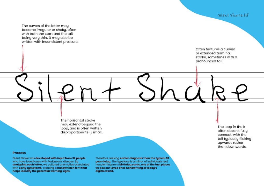
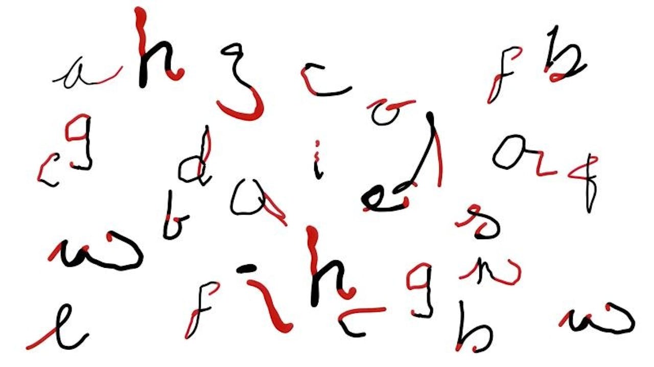
We studied birthday cards written by people with Parkinson’s and saw patterns repeat again and again. Tremors often reveal themselves on the page, and when we looked at the handwriting more, we found subtle signs such as gaps in letters, shrinking words (micrographia), exaggerated strokes, or unusually long tails. That’s when it clicked: if we could design a font based on these handwriting traits, we could turn these missed symptoms into a way to help spot a possible diagnosis.
Advertisement
But awareness alone wasn’t enough. We asked ourselves how we could make sure this idea actually helped people get diagnosed. That led to the creation of the Keep-Safe Card, a physical card printed with the Silent Shake font. It is designed as a simple and tangible tool that families can use to spot the early signs of Parkinson’s in an increasingly digital world. As Sue Daun said, “This wasn’t just design. It was emotional resonance through type.”
Our ambition was never just to make a font; we wanted to create something that could genuinely shift the way Parkinson’s is misdiagnosed. Many people can live with the condition for up to a decade before it’s formally identified, but earlier recognition means earlier treatment, and more years of quality life. Before submitting to D&AD, we shared the idea with Matt Eagles, a passionate advocate for Parkinson’s UK who has lived with the disease for 50 years. His encouragement reassured us that what we’d built wasn’t just creative, it had the potential to make a real difference.
Suggested newsletters for you
Daily Briefing
Daily
Catch up on the most important stories of the day, curated by our editorial team.
Weekly Marketing
Friday
Stay up to date with a curated digest of the most important marketing stories and expert insights from our global team.
The Drum Insider
Once a month
Learn how to pitch to our editors and get published on The Drum.
Silent Shake has the power to reveal diagnoses that may have otherwise been missed, leading to quicker prescriptions, earlier interventions, and ultimately longer lives. What began as a response to a student brief grew into something far bigger: not just a font, but a way of helping people see Parkinson’s differently.
I hope our story gives you a head start on your next big idea and helps you think outside the box to create work that really works.

This was shown first on: https://www.thedrum.com/opinion/2025/08/28/the-answer-isn-t-always-ad-we-created-font-help-diagnose-parkinson-s


